iPhone Duo Interface: Mandatory Sidebar Reduces Usable Area on Small Display
Early user reviews indicate Apple's new foldable wastes screen real estate on its 5.4-inch cover display, a layout choice that contrasts sharply with Samsung's Galaxy Z Fold 8.
By Alexander Novak ·
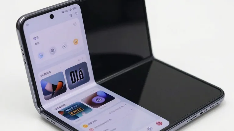
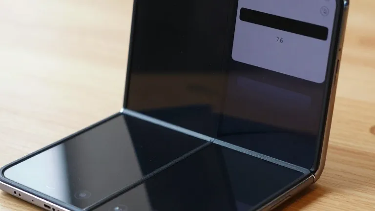
The iPhone Duo's mandatory sidebar on its 5.4-inch cover display consumes a portion of the screen that remains unused, reducing the effective area available for apps. This interface design choice has drawn immediate criticism from users and reviewers comparing the device to its direct competitor.
Allison Johnson, a writer for The Verge, noted that the iPhone Duo feels harder to use with one hand than the Galaxy Z Fold 8. The physical dimensions of the Samsung device, which is taller and narrower, allow for easier navigation on its outer screen. Johnson pointed out that this ergonomic difference is a major factor for consumers who value the utility of the cover display.
The primary technical complaint involves the placement of the dock on the right side of the iPhone Duo's small display. A post on Twitter/X highlighted that this layout leaves a large chunk of the screen essentially empty. The sidebar was intended to streamline navigation, but it restricts the usable space on an already compact 5.4-inch panel.
In comparison, the Galaxy Z Fold 8 utilizes a layout that minimizes wasted space. When set to use a navigation bar instead of gestures, the Samsung device shows a less stark difference in screen utilization. However, for users who prefer gesture controls on the Galaxy Z Fold 8, there is very little wasted screen space for main content.
Apple's strategy for the iPhone Duo involves shrinking the allowed space to stretch media, making it appear taller as it would on a slab device. The Galaxy Z Fold 8 approach leaves that space free for content, which reviewers suggest works effectively. This marks Apple's first attempt at a wide foldable, and early impressions suggest the software implementation lags behind the refined Android experience on Samsung's hardware.
The iPhone Duo is currently available with limited stock. The Galaxy Z Fold 8 continues to see success in the market, benefiting from years of Android refinements for larger screens. The contrast between the two devices' interface choices is now a focal point for buyers deciding between the two flagship foldables.
Source: 9to5Google